Search for:
🔍
カテゴリ
DX
Excel
PowerBI
Python
seaborn
ブログ
月別
2026年5月
2026年4月
2026年3月
トップ
トップ
カテゴリ
DX
Excel
PowerBI
Python
seaborn
ブログ
月別
2026年5月
2026年4月
2026年3月
Search for:
🔍
2026/04/30
初心者向け Python in Excel:xl() 関数でセルの値をPythonから扱う方法
Excel
Python
SATORU
2026/04/20
初心者向けPython in Excel : データ型について解説
Excel
Python
SATORU
2026/04/15
初心者向けPython:Excel作業を自動化したい人のためのPython in Excel
Excel
Python
SATORU
2026/04/07
数値のばらつきを可視化する:Seaborn ヒストグラムの基本
Python
seaborn
SATORU
2026/04/03
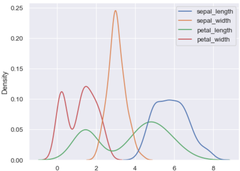
データの分布をなめらかに見る:Seaborn KDEプロット
Python
seaborn
SATORU
2026/04/02
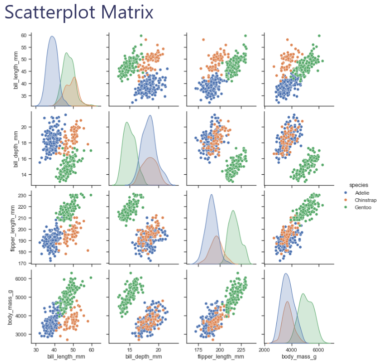
Seaborn入門:Pythonで始めるデータ可視化
Python
seaborn
SATORU
2026/03/22
ビジネスで役立つ!チャート・グラフの種類と使い分けガイド①
DX
ブログ
SATORU
2026/03/22
Excelデータ可視化の超入門 – グラフ作成編
Excel
PowerBI
SATORU
2026/03/22
データ可視化がビジネスを変える理由──アンスコムの例で解説
ブログ
SATORU
2026/03/22
なぜデータ可視化にストーリー(物語)が重要なのか?
DX
ブログ
SATORU
Posts navigation
Previous
1
…
4
5